There is something thrilling about flying - soaring thousands of miles at unimaginable speed around the globe. However, somewhere between check-in and boarding, I realised something...
Boarding passes are pretty awful.
You're standing in an airport. For many, airports can feel overwhelming. In a busy, fast-moving environment, knowing where you need to be, at what time and how to navigate the airport labyrinth is crucial. Therefore this should be as simple and stress free as possible...
The problem is, it isn’t.
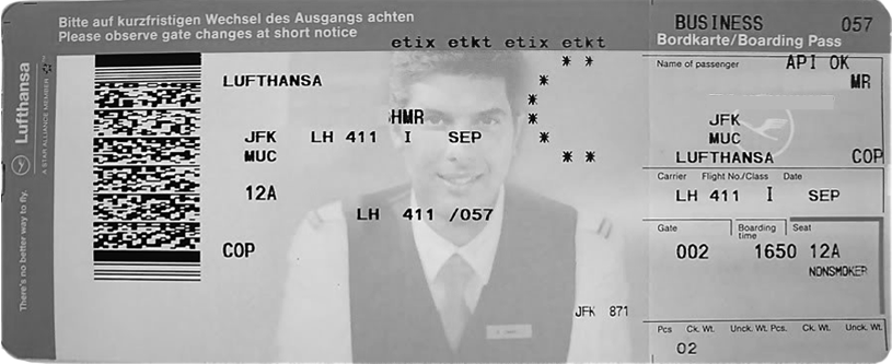
Obfuscated Information
Take a look at your boarding pass. It should quickly and simply communicate your next steps. The problem is, it doesn't. Instead, you're looking at a collection of strangely ordered acronyms, oddly formatted times and sequences that demand significant attention to decipher.
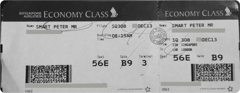
Poor Layout
You're on the way to the gate and you've tucked your boarding card into your passport and put it away. But the card extends from both ends. So, when you're trying to remember your gate or retrieve your card for the third set of security, it gets caught in your pocket, bends in your bag or falls out of your wallet. Boarding passes need to be kept safe. Their current format makes this difficult to do.
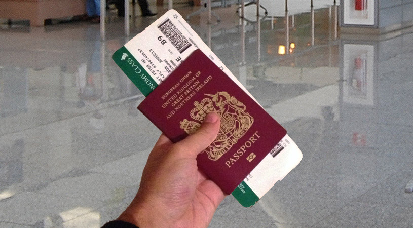
Lack of Empathy
Boarding passes are highly functional tools, used by both passengers and airline staff to successfully ferry passengers from airline desk to plane seat. They contain complex data, each line communicating important information to one or more sets of users. They’re used by three, distinct user groups:
1. Passengers
2. Airline Staff
3. Machines
Therefore, my solution could not simply be passenger focussed. It must be user focussed – meeting the distinct needs of both traveller and operator.
What if...
01.
What if key information was more accessible?
What if boarding passes could be rethought with real human need in mind?
02.
What if boarding passes felt less awkward to handle?
While maintaining the exact information, format, dimensions and not increasing the cost of printing.
03.
What if boarding passes added value to your travel?
Communicating information that helps makes travellers journeys easier.
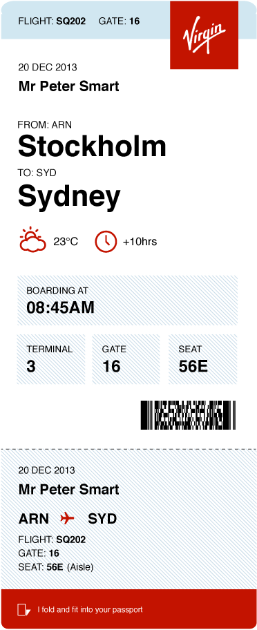
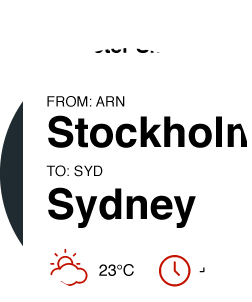
Clear hierarchy
Information is presented logically so you can quickly see what you need to.
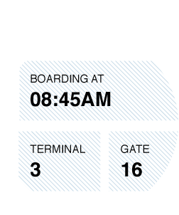
Legible information
Users need to see quickly and act confidently. Care has been taken to space and group information well.
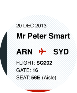
Simple structure
A simple three column grid keeps information well structured.
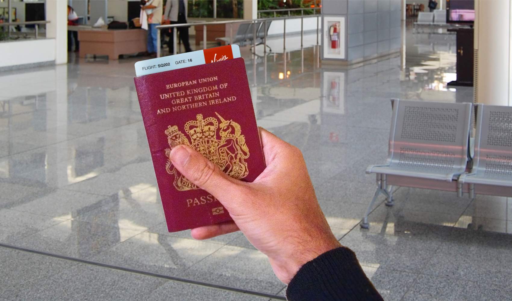
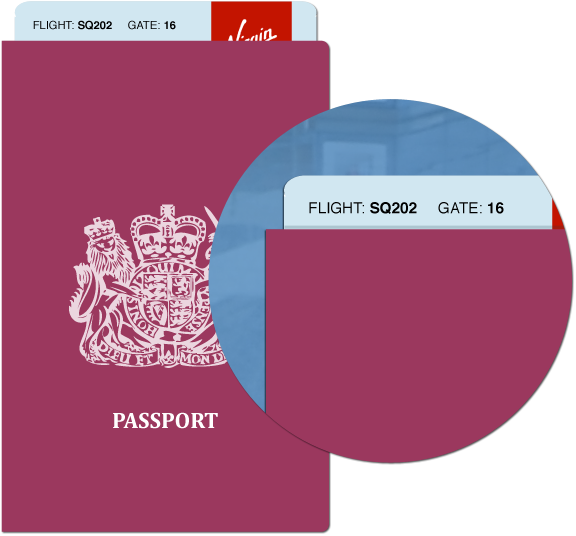
A boarding pass that fits in your passport.
What if your boarding pass naturally folded to the size of your passport? No more bends or breaks. Just simple reuse of the existing perforation.
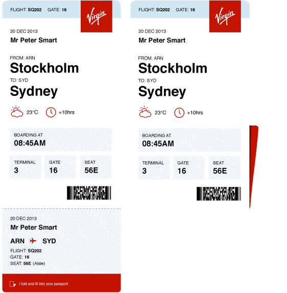
What you need.
At a glance.
Rather than having to take out your entire boarding pass when trying to remember your flight number, what if key information was just a glance away? This is helpful when trying to distinguish between multiple boarding passes too.
Same size.
New orientation.
Your boarding pass uses the same, standard dimensions of a old boarding pass. No new printers or cards – just a portrait orientation to reduce line length of information and make it easier to find and read.
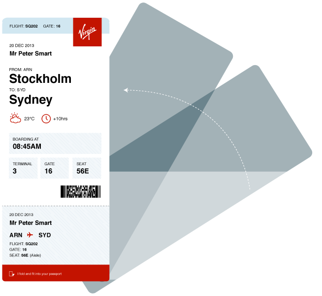
What if a boarding pass made things simpler?
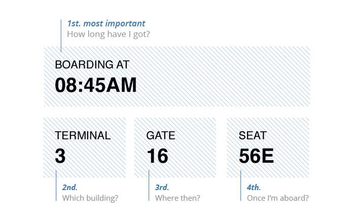
A helpful hierarchy.
What if information was laid out logically in chronological order? A simple grid makes information easy to read and quick to act on.
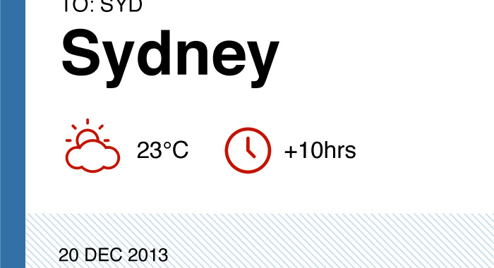
Will I need my coat ready?
Travel is simpler when you know what to expect. What if your boarding pass tipped you on the weather, or how far to wind your watch on?

Once you're aboard.
Once you’ve gone through your gate, you’ll be left with your stub. What if it didn’t just let you know your seat number, but what kind of seat you’ll be sat in too?
A simple framework.
Although each airline will have its own unique information, used by passengers and ground-crew alike, imagine a consistent experience – one that is immediately understandable, no matter who you’re flying with.
Innovation starts when you ask simple questions.
These ideas are the result of 14 flights, 14 boarding passes and one, simple question: “How could this experience be better? The solution is by no means perfect and further iterations will see greater levels of refinement. However, as designers our aim should be to question what is otherwise accepted – a relentless mission to better, simplify and improve the experiences of other people.
Innovation starts with a natural distrust of the status quo. When you’re prepared to start asking simple questions of everyday things – the world is suddenly full of possibilities.
Like this post? You might also enjoy www.50problems50days.com